Some Chart Types You Can Build with dxFeed Data
Introduction
This page presents multiple chart types that you can build using the dxFeed Aggregated Data Services. Various platforms define their own ways of displaying this information, and the following examples are only a subset.
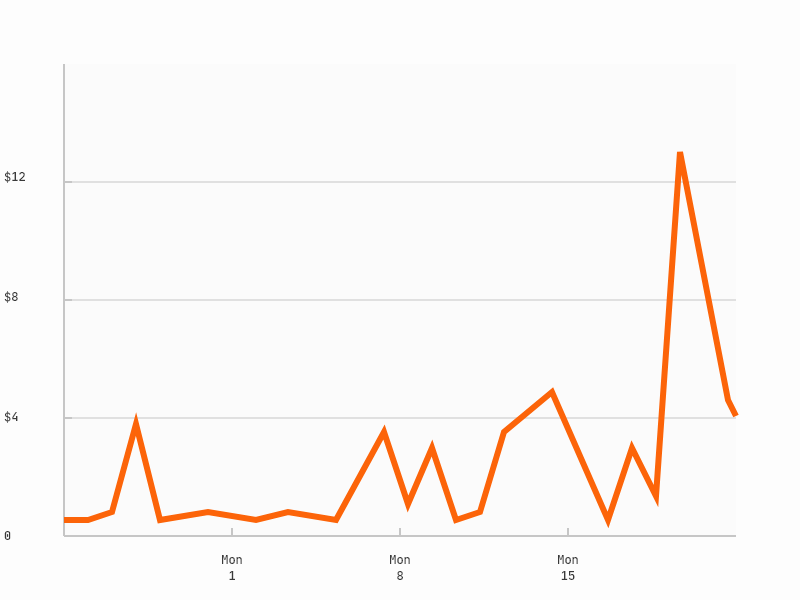
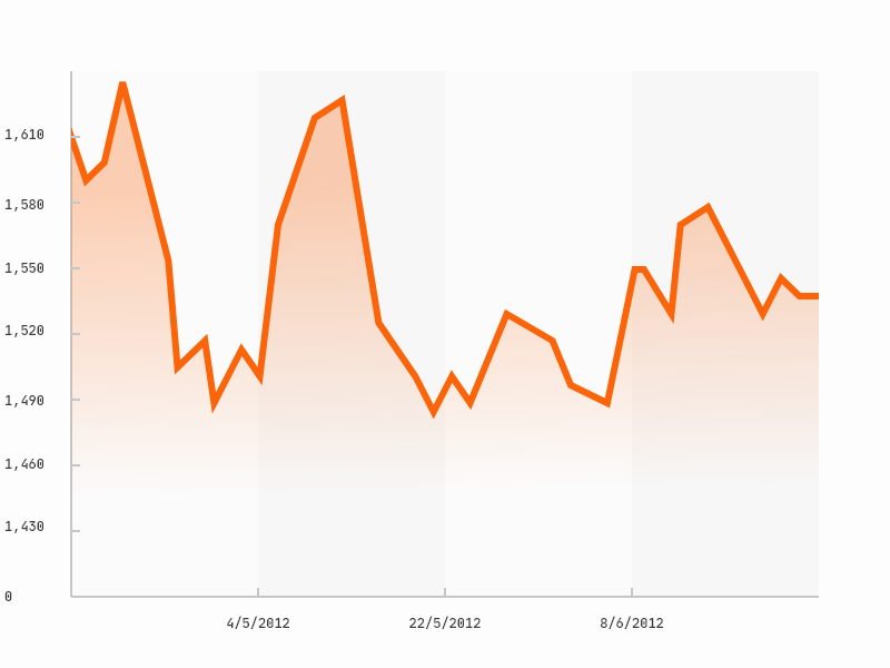
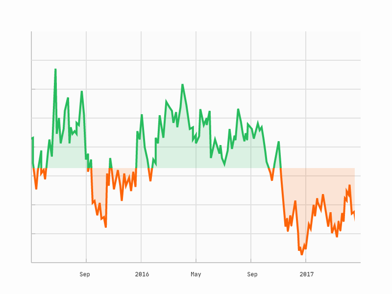
Line, Mountain or Baseline charts
The simple, basic type of chart, displaying just one data point for each specific moment in time. With the dxFeed Aggregated Data Services, this data point can be not just the price, but also volume, implied volatility or open interest. Any candle type can be used for this purpose depending on the needs (see Aggregated Data Services Overview article in the dxFeed Knowledge Base).
 |
 |
 |
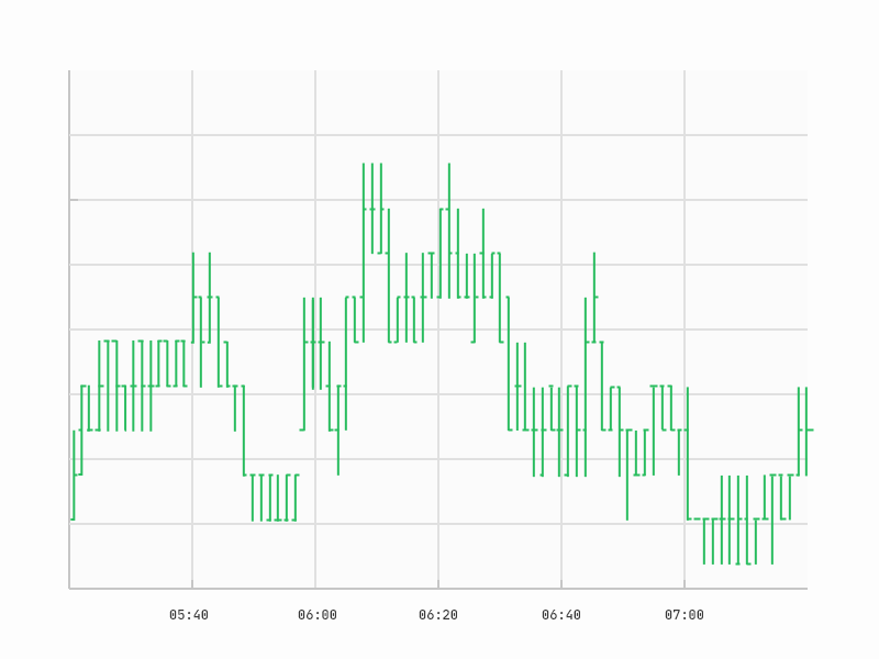
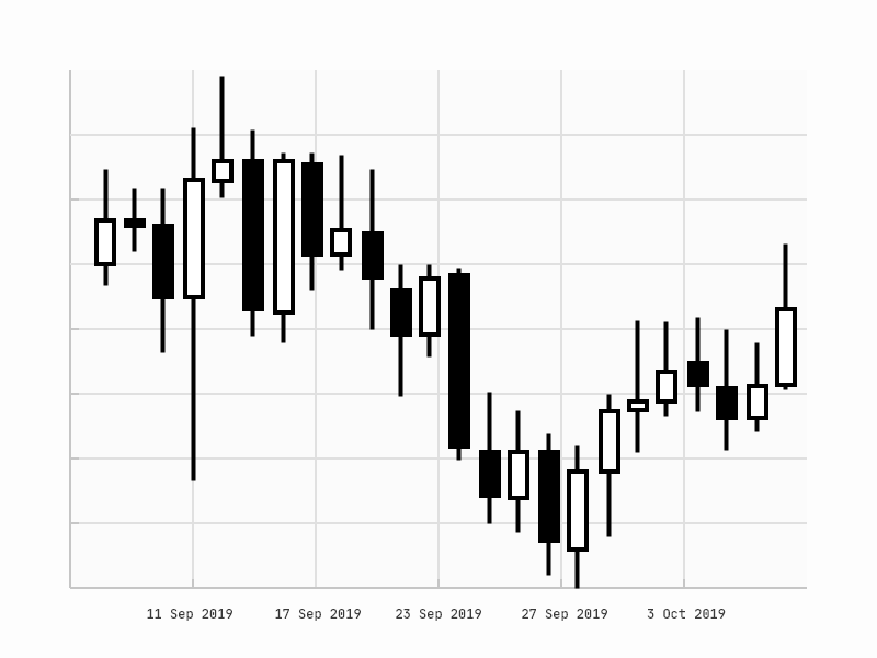
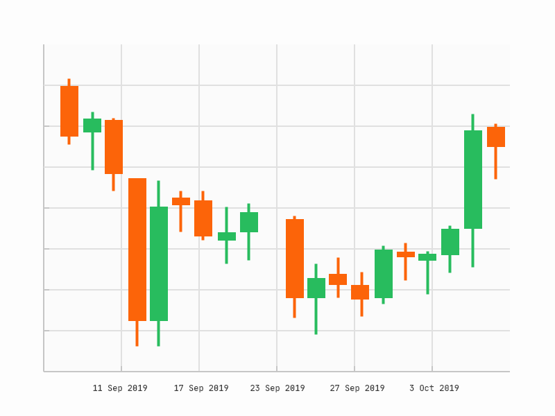
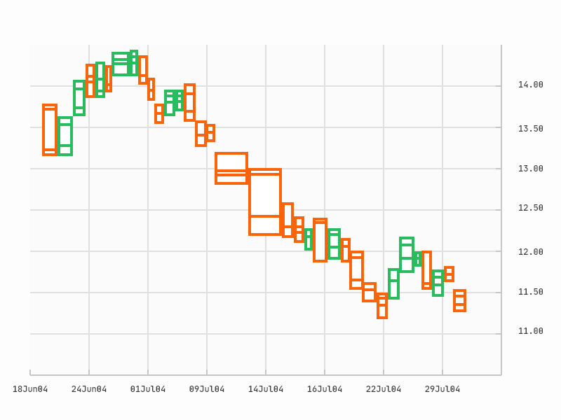
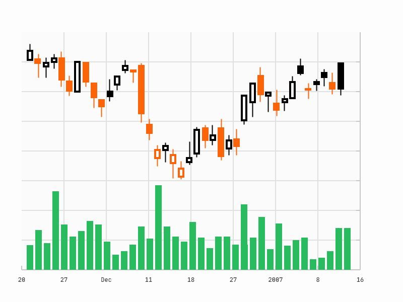
Bar, Candlestick or Hollow Candlestick chart
Bar or Candlestick charts are the most popular chart type, both with professional and non-professional traders.
The candles displayed on the graph can be time-, tick- or volume-based.
OHLC prices are defined by the market trades, ask, bid or mark prices - see how to request the data from dxFeed.
The aggregates can include the events that happened just during regular trading hours or during both regular and extended trading hours.
 |
 |
 |
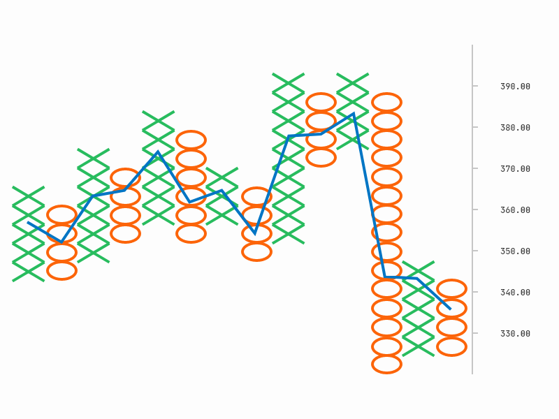
Point and Figure chart
These charts are independent of time and are determined only by price movement:
The X columns indicate upward price movement.
The O columns indicate downward price movement Whether an X or an O is drawn depends on the direction of the price movement. A new X/O is drawn after a price moves a specific amount of points, and a new box is drawn after the price changes direction and changes by a user-defined amount.
dxFeed allows you to configure and receive a new candle after any price change - please use price-based and price-momentum candles to display the Point and Figure chart. dxFeed candles also allow you to display OHLC and volume of every specific X or O.
 |
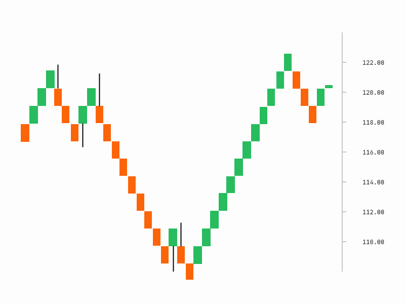
Renko
This is one of the most popular chart types, allowing the viewer to concentrate only on price actions.
This is a type of chart that is built using just the price movement instead of both price and standardized time intervals like most charts. A new brick is created when the price moves a specified price amount, and each one is positioned at a 45-degree angle (up or down) to the prior brick. An "up" brick is typically colored white or green, while a "down" brick is typically colored black or red. Read more on Investopedia.
dxFeed Aggregated Data Services have Renko candles that allow you to define the Renko box size.
 |
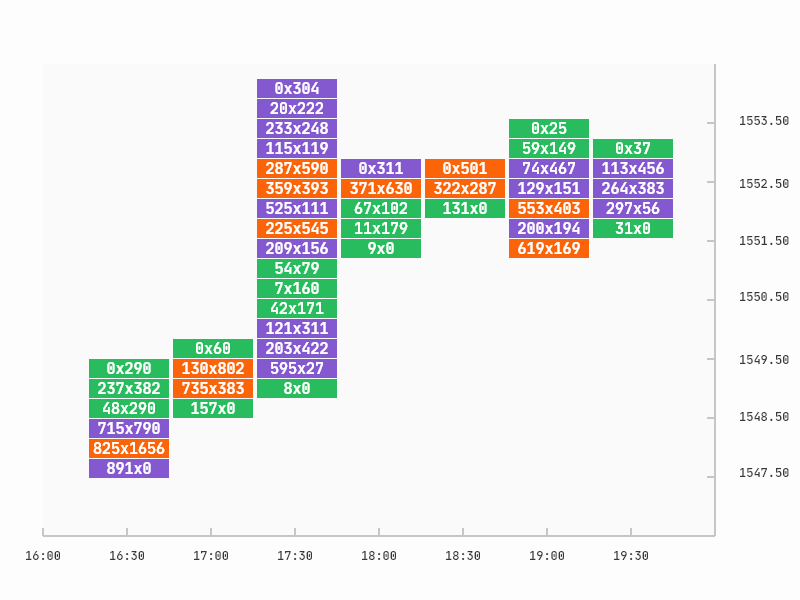
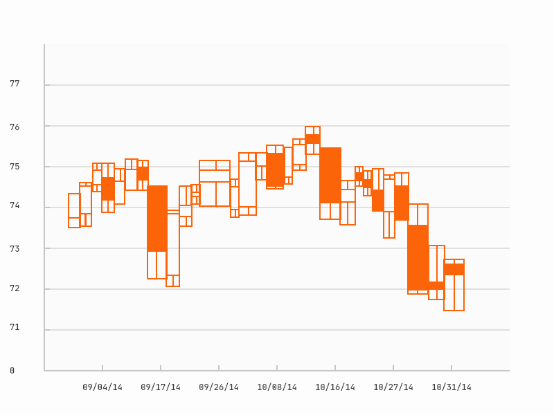
Volume Delta by price increment chart
The Volume delta by price increment chart displays the bid or ask trade volume per every time-aggregated candlestick. The candlestick is divided into boxes per a specific price increment.
dxFeed provides all of the information required to draw such charts via price level candles, that allow you to:
Define the time-aggregate and the price increment of the candlestick
Receive bid and ask volumes per every candle
 |
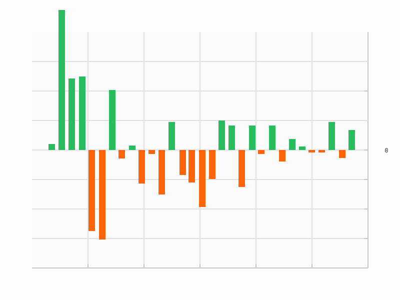
Cumulative Volume charts
Cumulative Delta chart shows the difference between buy and sell volume per a specific time aggregate. The data required for construction can be received via the standard dxFeed time-based candles.
 |
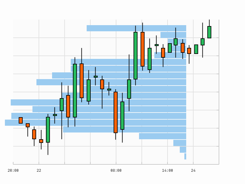
Volume Profile chart
Volume Profile provides you with tools for price action and trading volume analyses in parallel. To build charts of this type using dxFeed data:
Request the standard time-based candles of the required granularity (45 min in the picture below) to display the candle series
Or request the price level candles of the required granularity (15 hours in the picture below) and price increment to display the volume profile
Every dxFeed candle also carries respective bid/ask volume information, providing you with still more insights.
 |
Options Expiration Frequency chart
The options expiration frequency chart is an advanced chart useful to experienced option traders. It is supported by a limited set of platforms. The chart allows option traders to build such candlestick graphs that the time for aggregation depends on the frequency of option expiration:
Weekly options expiring on Wednesday will be displayed by weekly-aggregated candles that start on Thursday
Standard options expiring every 3rd Friday of the month will be displayed by monthly-aggregated candles that start on the 4th Monday of the month
You can use dxFeed option expiration candles to display charts of this type.
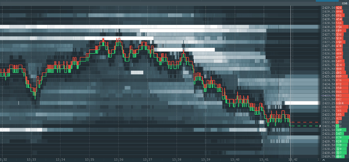
Historical Market Depth chart
Market data contains information not only about realized trades but also about the orders waiting to be matched. Some advanced traders analyze the evolution of the order book, using this data to predict the future price movement.
dxFeed provides a special charting solution named ORCS to present data of this type on a graph. You can draw the Historical Market Depth graphs with any number of price levels and in historical periods receive updates of every price level with predefined frequency. Screenshot from dxFeed Bookmap platform is displayed below:
 |
More information for your charts
Volume: CandleVolume, EquiVolume, Arms CandleVolume charts
Volume is a really popular characteristic to be displayed on a chart. There are variations of the popular candlestick chart, including:
CandleVolume: in addition to the OHLC the respective trading volume is drawn at the bottom of the graph
EquiVolume: the candlestick width represents the trading volume for the respective period
Arms CandleVolume: combines the width and the original candle sticks on one chart
 |
 |
 |
Options, Open Interest and Implied Volatility
Every dxFeed options candle contains information about the option’s implied volatility and open interest. This information can be really supportive for option trades if it’s added to the standard candlestick chart or additionally drawn using Line or Mountain charts.